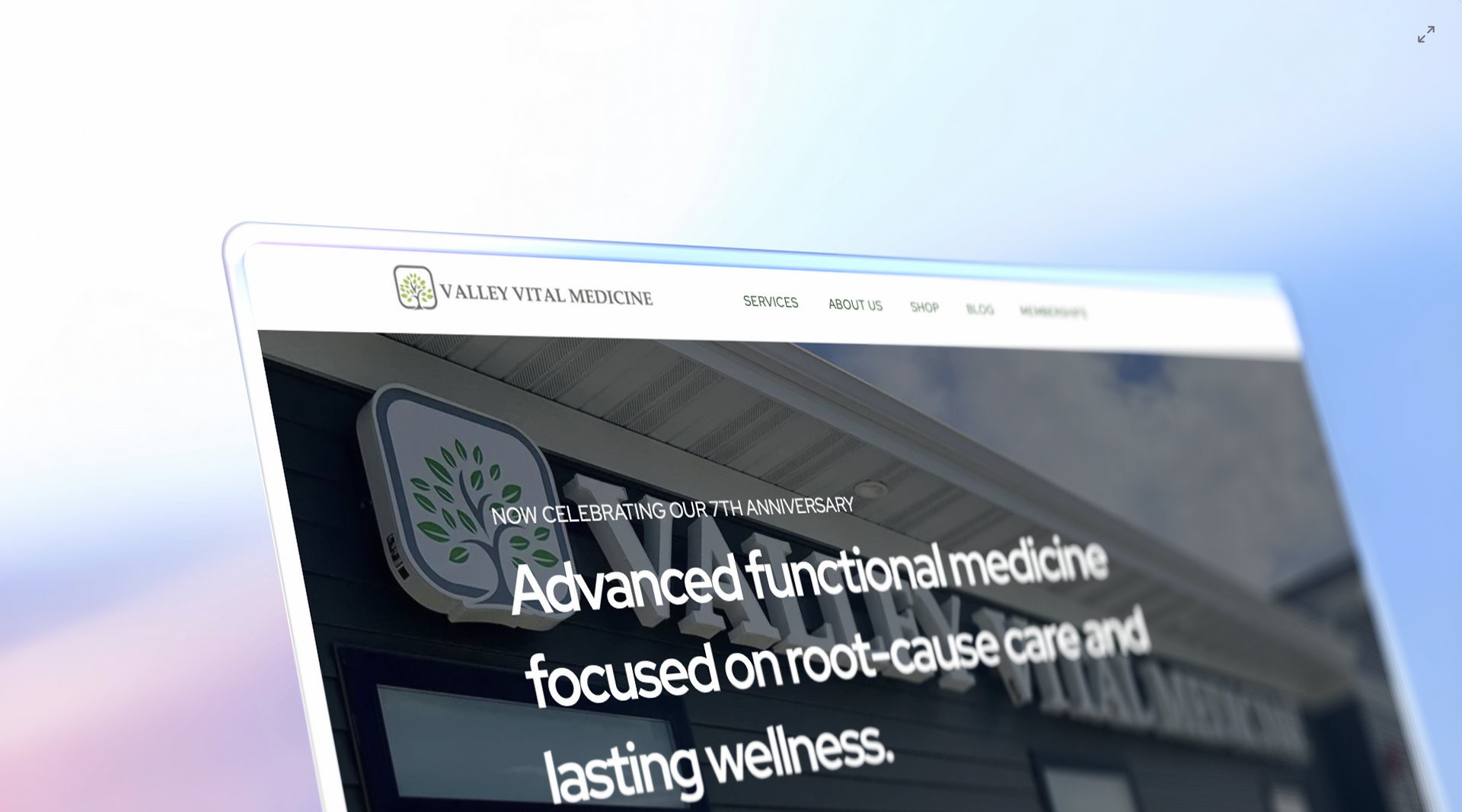
Functional Medicine Branding Basics
When most practitioners think about "branding," they think about what they personally find beautiful. They might love bright, vibrant colors, neon accents, or highly decorative calligraphy. While these elements might make for a stunning art portfolio or a trendy boutique, they can be devastating for a functional medicine practice. To understand why, we have to look at the psychological state of your prospective patient.
By the time someone finds your website, they have often been through the ringer of the conventional medical system. They are tired, frustrated, and potentially in physical pain. They are looking for a guide, not a party. A website that is too "busy" or "bright" triggers a subtle stress response in a brain that is already overloaded.
If your website feels like a digital strobe light, the patient’s subconscious reaction isn't "Wow, how stylish!" it’s "This is too much; I can't think here."
Functional medicine branding succeeds when it prioritizes emotional safety over aesthetic trends. Patients seeking functional care are often in a fragile state, searching for answers to chronic issues. Your brand should use calming visuals and empathetic messaging to subconsciously signal that your practice is a safe, professional place for healing.
Why does a "pretty" website often push patients away?
In the world of healthcare, "pretty" is often a distraction. A high-performing functional medicine website focuses on clarity.
When a patient is in a fragile emotional state, they are looking for evidence of competence and calm.
If your branding is too focused on being "on-trend" with fancy animations and jarring color palettes, you are inadvertently signaling that you care more about your image than their comfort.
Trust is built in the quiet moments of a user experience, not in the loud ones.

The Truth About Visual Cues in Functional Medicine Branding
Visual cues are the shorthand for your practice’s values. Every choice you make, from the thickness of your font to the saturation of your photos, tells a story before the patient even reads a single word.
In functional medicine, the story needs to be one of stability and root-cause resolution. This is why professional branding often leans into the "Less is More" philosophy.
Consider the concept of white space. In high-end design, white space (or negative space) is the breathing room between elements. For a patient who feels like their health is spiraling out of control, a website with plenty of white space offers a sense of order. It suggests that you have the time and the mental space to actually listen to their complex health history. Conversely, a cluttered website suggests a cluttered mind and a rushed practice.
Typography also plays a massive role in functional medicine branding. While it might be tempting to use a thin, elegant script for your headings, readability should always come first. If a patient has to squint to read your "About Me" section, you’ve already created a barrier to entry.
- Use clean, Sans-Serif fonts for body text to ensure readability.
- Limit font variations to two or three at most to maintain consistency.
- Ensure high contrast between text and background.
- Avoid "loud" all-caps headings which can feel like shouting.
- Use Serif fonts sparingly for a classic, authoritative feel in headings.
When we look at our approach to design , we focus on these subtle cues to ensure the patient feels heard before they even send an email. Branding isn't just about a logo; it’s about the environment you create for your digital visitors.
How can your branding improve patient trust instantly?
Trust is the currency of functional medicine. Unlike a quick care clinic where a patient just wants an antibiotic, functional medicine requires a deep, often long-term commitment. Patients are going to share their most intimate health details with you. Your branding needs to reflect that you are worthy of that vulnerability from the second the page loads.
One of the fastest ways to build trust is through high-quality, professional photography of you . Stock photos of generic doctors with stethoscopes are a trust-killer in this industry. Patients want to see the person who will be helping them. They are looking for a face that expresses empathy, intelligence, and approachability. If your branding relies on "stocky" visuals, it feels clinical and cold. If it uses authentic imagery, it feels human.
Another trust-building element is the "Experience Path." This is the way you guide a user through your site. A well-branded site doesn't leave the user wondering where to go next. It provides a clear, logical flow that mirrors a professional consultation. By taking control of the user's journey, you are demonstrating your leadership as a practitioner. You are showing them that you have a plan for their health journey, starting with their first click.

Essential Elements of High-Converting Medical Branding
To move beyond just a "pretty" site and into a high-converting practice asset, you need to integrate specific elements that speak to the logical and emotional needs of your audience. Branding is the marriage of psychology and strategy.
- A Clear Value Proposition: Within three seconds, a visitor should know exactly who you help and what problem you solve.
- Social Proof: Testimonials and case studies should be styled to feel like integrated parts of the brand, not afterthoughts.
- Cohesive Color Palette: Colors should be used to highlight important actions (like your CTA) without overwhelming the senses.
- Simplified Navigation: A confused mind always says "no." Your menu should be intuitive and focused on the patient's needs.
- Professional Copywriting: The words you use must bridge the gap between your clinical expertise and the patient’s lived experience.
If you find that your current site has these elements but still isn't converting, it might be time to book a call to discuss a strategic audit. Often, the issue isn't one single thing, but a lack of harmony between the message and the visuals. When the two are aligned, the friction in the patient's decision-making process disappears.
What colors work best for a medical practice website?
Color psychology is a well-documented field, and in functional medicine, it is your secret weapon.
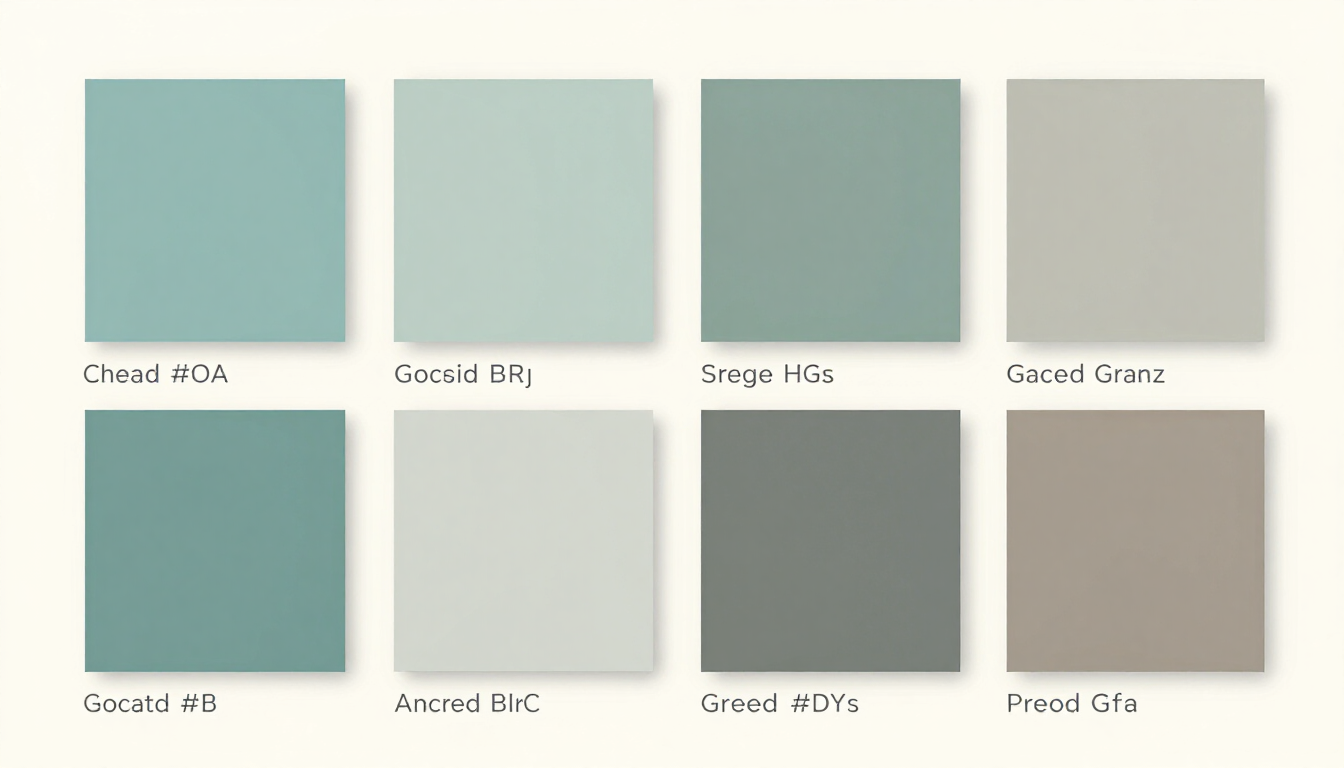
The goal is to choose a palette that evokes health, nature, and professionalism. We often look toward the natural world for inspiration because functional medicine is fundamentally about returning the body to its natural, balanced state.
Soft greens, muted blues, and warm earth tones are staples for a reason. Blue is globally recognized as the color of trust and authority. Green represents growth, renewal, and vitality. However, the shade matters immensely. A neon lime green feels like a tech startup; a sage or forest green feels like a healing retreat. Similarly, a bright royal blue can feel like a corporate bank, whereas a soft slate blue feels like a calming sea.
Avoid high-energy colors like bright red or orange as primary brand colors. These are "warning" colors in nature and can increase heart rates and anxiety levels. If you must use them, keep them for small "call to action" buttons that need to stand out, but never let them dominate the visual field. Your brand's color story should be the digital equivalent of a deep breath.
Ultimately, your branding is the bridge between your clinical expertise and the people who need it most. If the bridge looks shaky or too flashy, people won't cross it. But if it looks sturdy, welcoming, and clear, they will walk across it with confidence. Creating a custom-branded website isn't an ego project; it's a vital part of your patient care. It’s the first step in the healing process.
To see how we’ve helped other practitioners build these bridges, feel free to browse our latest projects . Your practice deserves a digital home that works as hard as you do to change lives.
Summary of Functional Medicine Branding Success
To build a successful brand for your functional medicine practice, you must move beyond superficial aesthetics and focus on psychological resonance.
Patients who arrive at your site are often overwhelmed; your job is to provide a digital environment that offers immediate clarity and calm.
By prioritizing trust-based design—including professional photography, muted color palettes, and clear value propositions—you signal that your practice is a safe harbor for healing.
Avoid the trap of "pretty" but distracting trends. Instead, invest in a cohesive strategy that aligns your visual identity with your clinical excellence to convert visitors into lifelong patients.
- Prioritize empathy and calm over flashy design.
- Use professional, authentic photography to build personal trust.
- Choose color palettes inspired by nature to evoke healing.
- Ensure your copywriting speaks directly to the patient's emotional state.
- Book a call to start building your professional practice brand today.
Recent Posts